1
/
of
3
Liquidly
Display Different Image Banner on Desktop vs Mobile
Display Different Image Banner on Desktop vs Mobile
Regular price
£9.99 GBP
Regular price
Sale price
£9.99 GBP
Taxes included.
★ ★ ★ ★ ★
Rated 4.9/5 by 202 Happy Customers
Conditionally display image banners or other sections on desktop and mobile. Create unique experiences depending on your customer's device.
View full details
Quantity
Couldn't load pickup availability
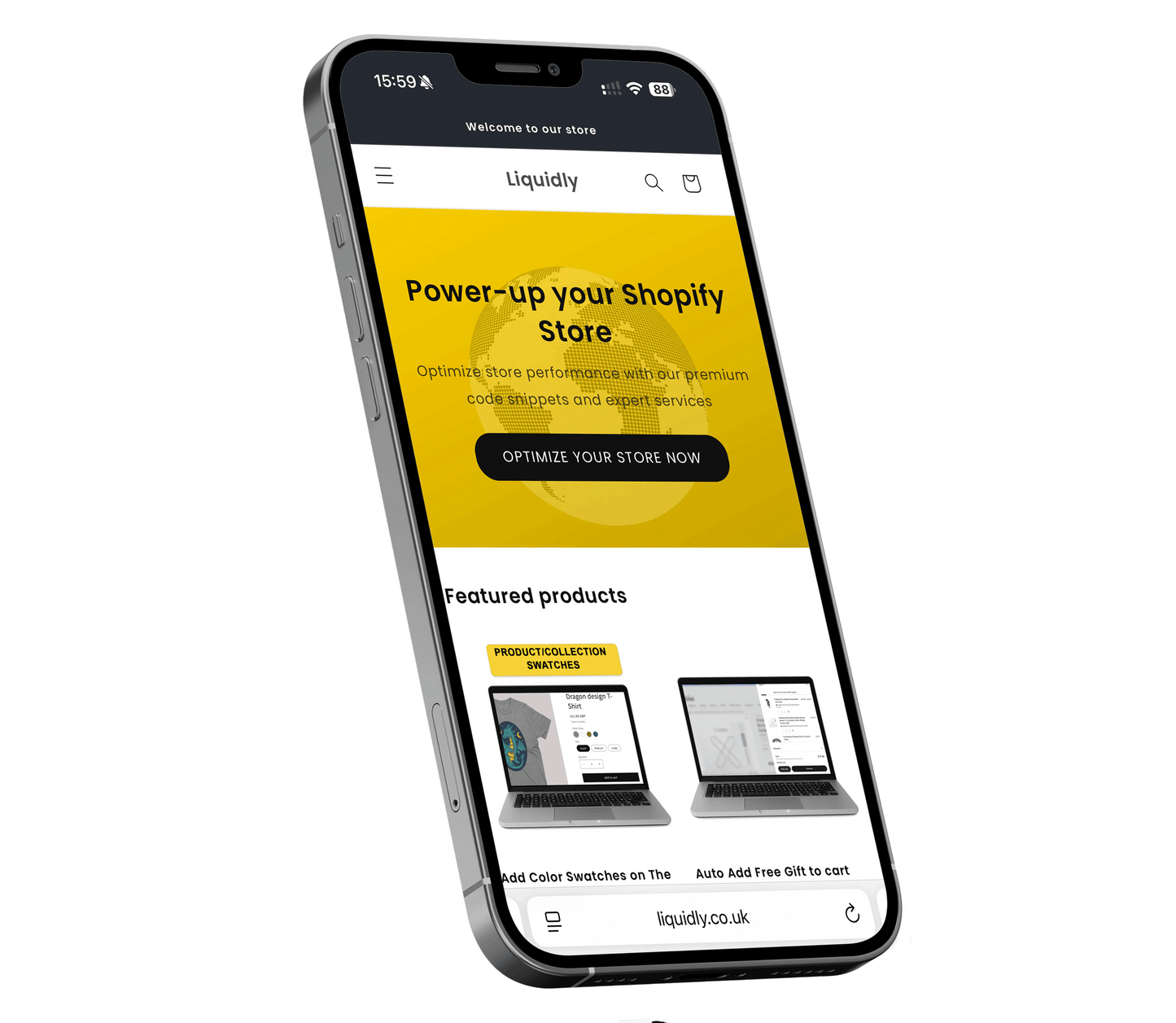
Easily display a different header image for mobile and desktop devices with this lightweight, theme-compatible code snippet. Perfect for tailoring your brand visuals to different screen sizes and optimising the user experience on every device.
What this does:
✅ Automatically shows a mobile-optimised image on phones
✅ Keeps your original desktop header image for larger screens
✅ Seamless experience for customers, no extra apps required
✅ Works with Shopify’s Dawn theme and most OS 2.0 themes
What’s included:
- Code snippet with full instructions
- Step-by-step video tutorial
- Compatible with Shopify’s theme editor
No app, no bloat — just clean, efficient code you can drop into your theme for instant results.
Share


- Choosing a selection results in a full page refresh.
- Opens in a new window.


